Proposed Improvements to the iOS Banking App
Role: UX/UI Designer
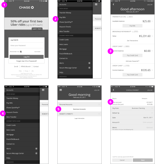
I use the Chase mobile app to perform a good deal of banking on the go. While the app works well, I thought there where some opportunities to make the app more user friendly and efficient. After I performed a content inventory of the existing app, I felt that the areas where the site could be improved were:
- Optimize login process easier for 1 handed operation.
- Easier access and findability to bill pay, credit card pay and QuickPay.
- A visual way to differentiate between credit cards
- Quicker access to camera on check deposit feature
- Ability to quickly switch between different account types
- Simplified bill payment, with more visual hierarchy
Provide mobile users with a better banking experience by providing quick access to core features like making deposits, paying bills, checking and paying credit card balances, and using QuickPay.

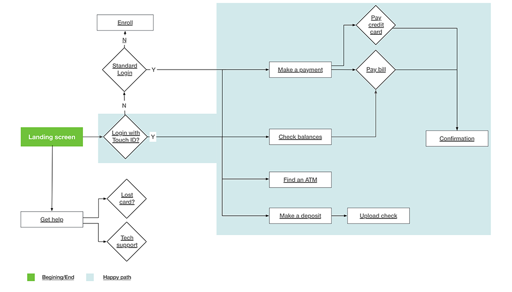
Userflow
In order to ensure I was building the right thing, I started by building a User flow. What where the minimum steps required to perform key tasks?

Sketches:
To understand how the flow could translate into a usable product I started brainstorming around how the app could function. My initial sketches focused on the idea of being able to be able to pay bills, review balances, pay credit card balances, and make quick payments immediately after log in. I wanted to really explore how the pay stream worked and started designing around creating a visual more intuitive way of improving that.
I decided to break the accounts in to three buckets:
- “Personal accounts”
- “Business accounts”
- “Investments"
While this content organization seemed the most logical I felt this didn’t solve the problem of being able to switch quickly between accounts. It also lacked visual cues to allow a user to quickly differentiate between accounts. After doing some research, I was inspired to look for a more engaging solution. Swiping has been proven to be the fastest method for interaction and engagement on a mobile device. What if we could allow the user to quickly swipe between accounts with a visual prompt like an image of their bank or credit card? I pivoted and began to change my wires based on this.
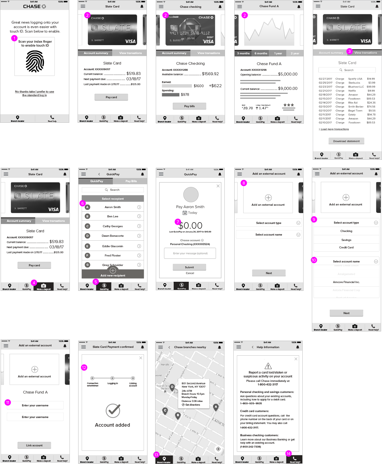
Wireframes
- TouchID for log in
- Swipe between account types (credit cards, checking, investments)
- Ability to toggle between “account summary” and “transaction history”
- Easy access to deposits or camera feature
- Easy to access QuickPay
- Quickly select or add recipient
- Prominent payment amount entry field
- Ability to link an external account
- Select account type
- Select account name
- Enter username and password to link external account
- Progress bar and confirmation for adding external account
- Easy to access branch locater
- Quick access to help

Prototype:
To illustrate how the app works I created a basic prototype of the key screens.


